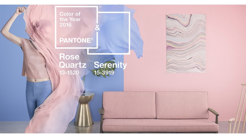
Back in December to everyone’s surprise, Pantone announced not one, but two colors of the year for 2016. The pair, Rose Quartz 13-1520 and Serenity 15-3919, “demonstrate an inherent balance between a warmer embracing rose tone and the cooler tranquil blue, reflecting connection and wellness as well as a soothing sense of order and peace”, says Leatrice Eiseman, Executive Director, Pantone Color Institute.
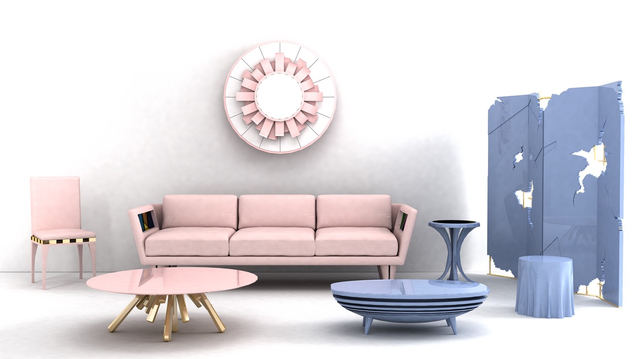
Evidence of the soft pastel hues can be found everywhere, from the runways, to furniture and lighting, to cosmetics, art, retail space, and packaging. The pale palette is both refreshing in its icy blue tints and comforting in its velvety blush tones. The warm and cool juxtaposition feels playful, yet incredibly sophisticated at the same time.
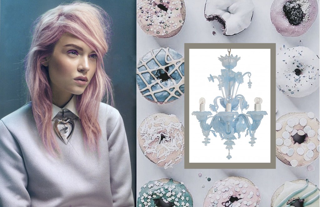
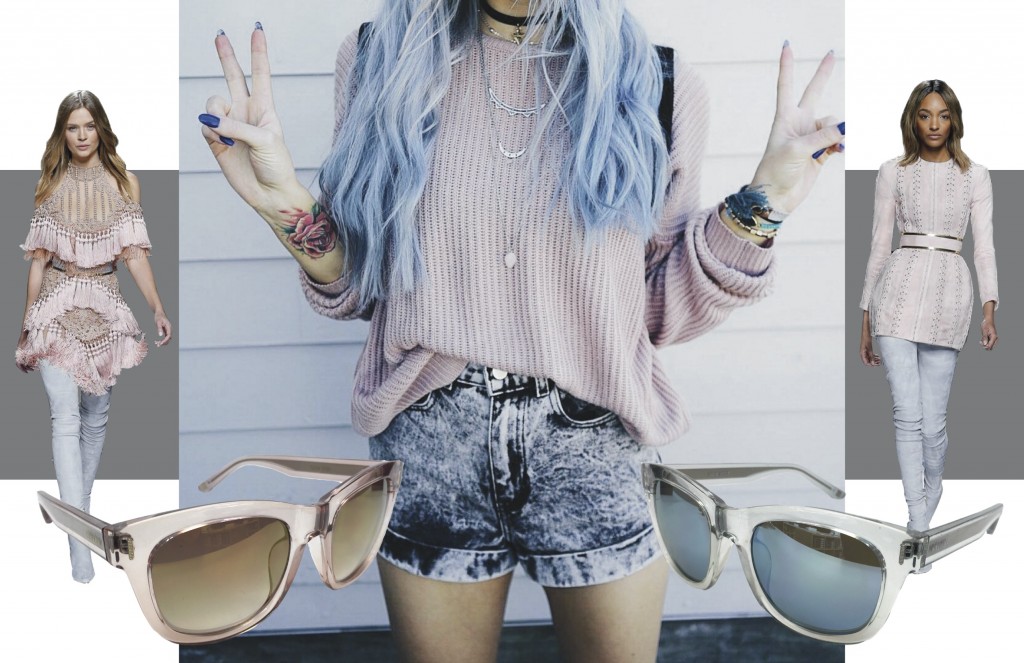
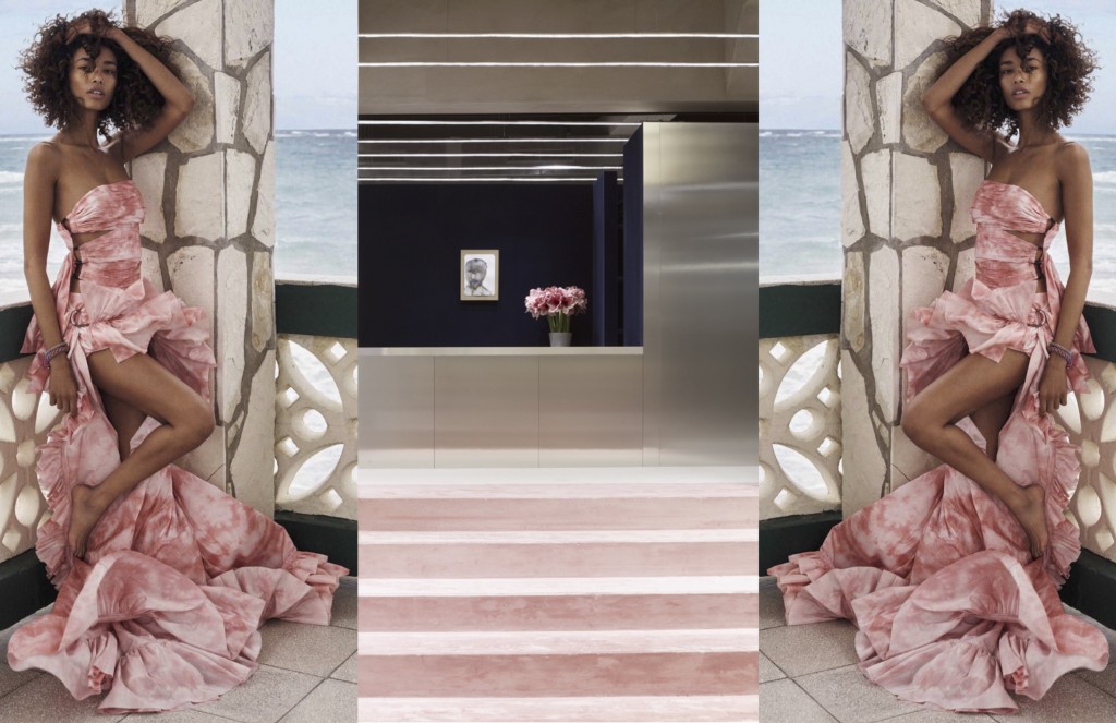
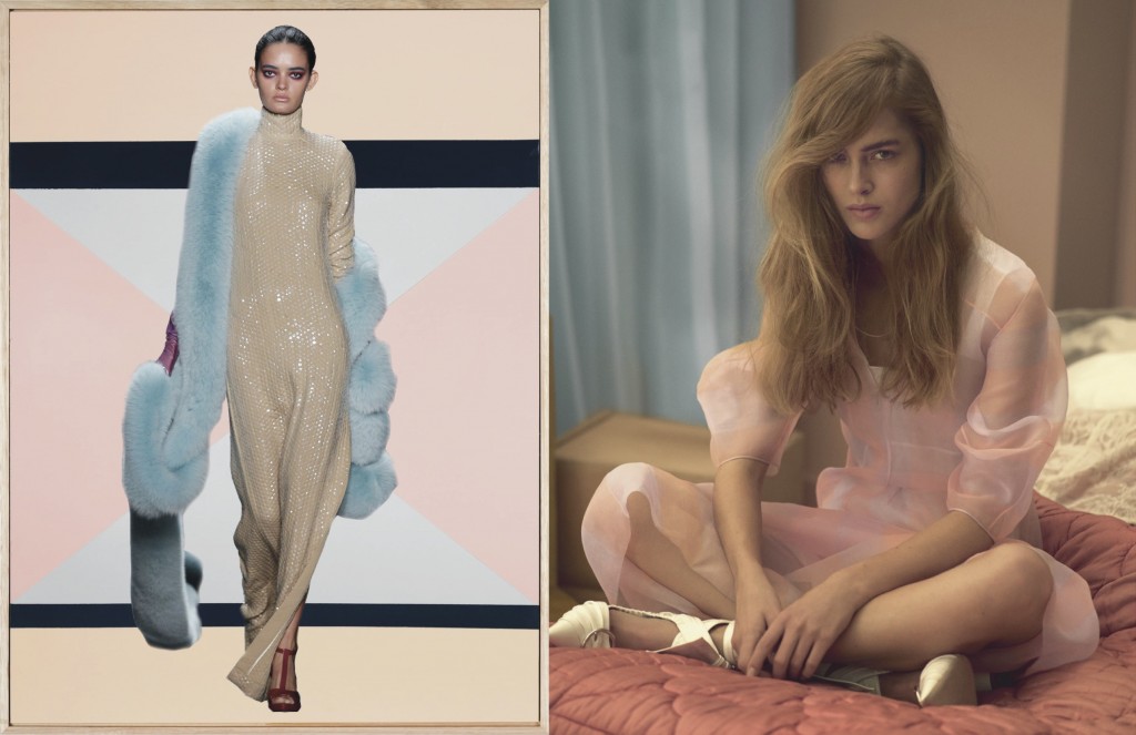
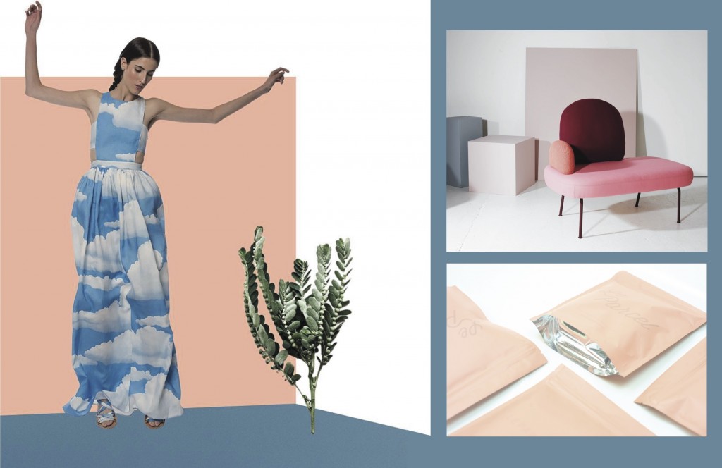
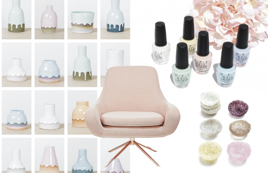
Rose Quartz hair via unusual-hairstyles.com. Modern 6 light crystal opaline chandelier via abchome.com. Donuts via @balynbrittany instagram.Runway looks, Balmain Fall 2016 via fashionstylemag.com. Nine West sunglasses via ninewest.com. Image via @balynbrittany instagram.Anais Mali by Benny Horne for Vogue Spain April 2016 via ilovewildfox.com. Acne Studios, Paris store via ilovewildfox.com.Runway look by Georgine, Spring 2016 via georgine.com. ‘Nobody But You’, painting by Esther Stewart via ilovewildfox.com. Image on right from Dior Magazine Spring 2016 via thefashionography.comImage via @marahoffman instagram. Furniture ‘Between’ by Sara Wright Polmar via sarapolmar.no Packaging by LeParcel via thedieline.comCeramic pots by The Sill x Brian Giniewski via notcot.com. Softline coral swivel lounge chair via abchome.com. OPI Soft Shades Pastels via perilouslypale.com. Jess Panza Coquille Bowls via abchome.com
 RSS
RSS Feedly